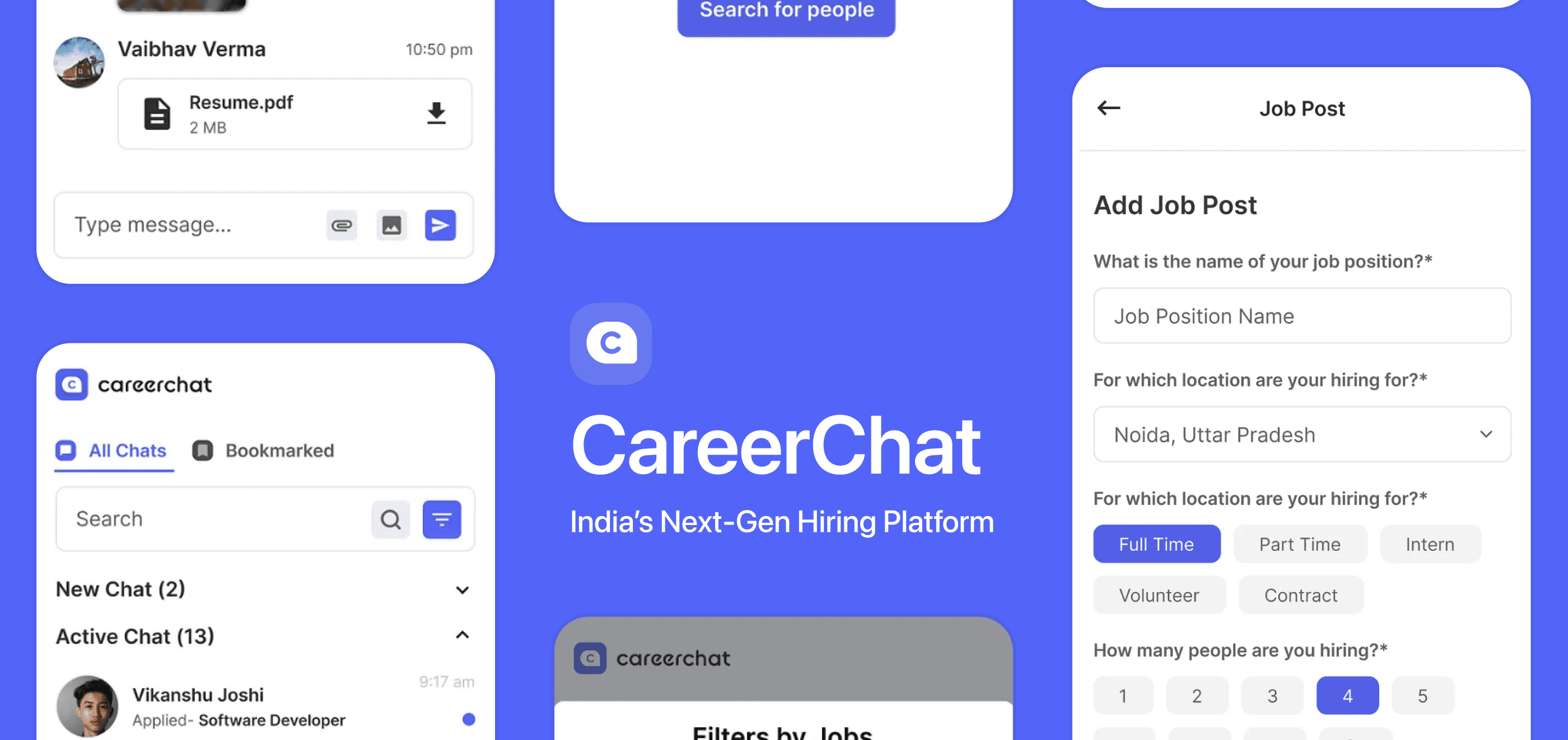
CareerChat
Redesigning India's Next-Generation Hiring Platform
Timeline
January 2021 - April 2021
Role / Context
Lead Product Designer / Team Project with Vaibhav Verma and Rajat Saini
Leveraged Skills
Digital product design, UX/UI design
BACKGROUND
During the Spring of 2021, I led the redesign of CareerChat as a lead product designer of the design team at McKinley Rice.
Due to my backgrounds in digital product design and front-end development, I was hired as the lead product designer of the design team, tasked with leading the redesign of CareerChat. CareerChat is a hiring platform developed by McKinley Rice that targets India’s job market - the product has now pivoted as Redrob.
After the redesign, internal testing proved the success with a drastic increase(18.75%) in the average of SUS(System usability scale).
My responsibilities included:
✍️ Planning & Leading the Redesign Process and Sprints
🏃♂️ Collaboration with XFN(Engineering, Marketing) and C-suites
💻 Engineering the interfaces with other developers
RESULT
Complete overhaul, sticking to the basics
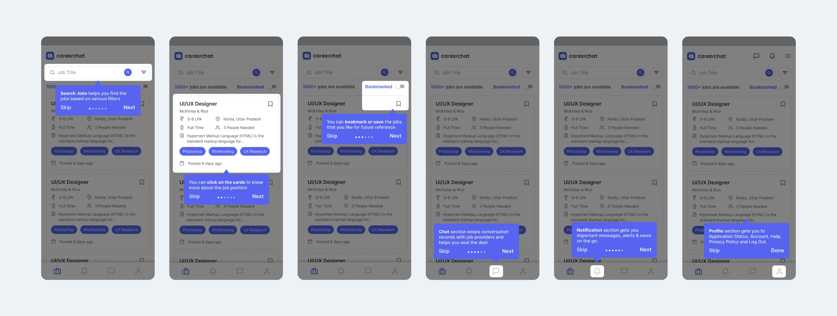
🦮 Intuitive Tutorial on Core Features
Designing a tutorial that was nonexistent
BEFORE
Tutorial didn’t exist prior to the redesign.
AFTER
Using elements with strong visual hierarchy, tutorial instructs users on the core features of the product - search, viewing, filtering jobs and profiles.
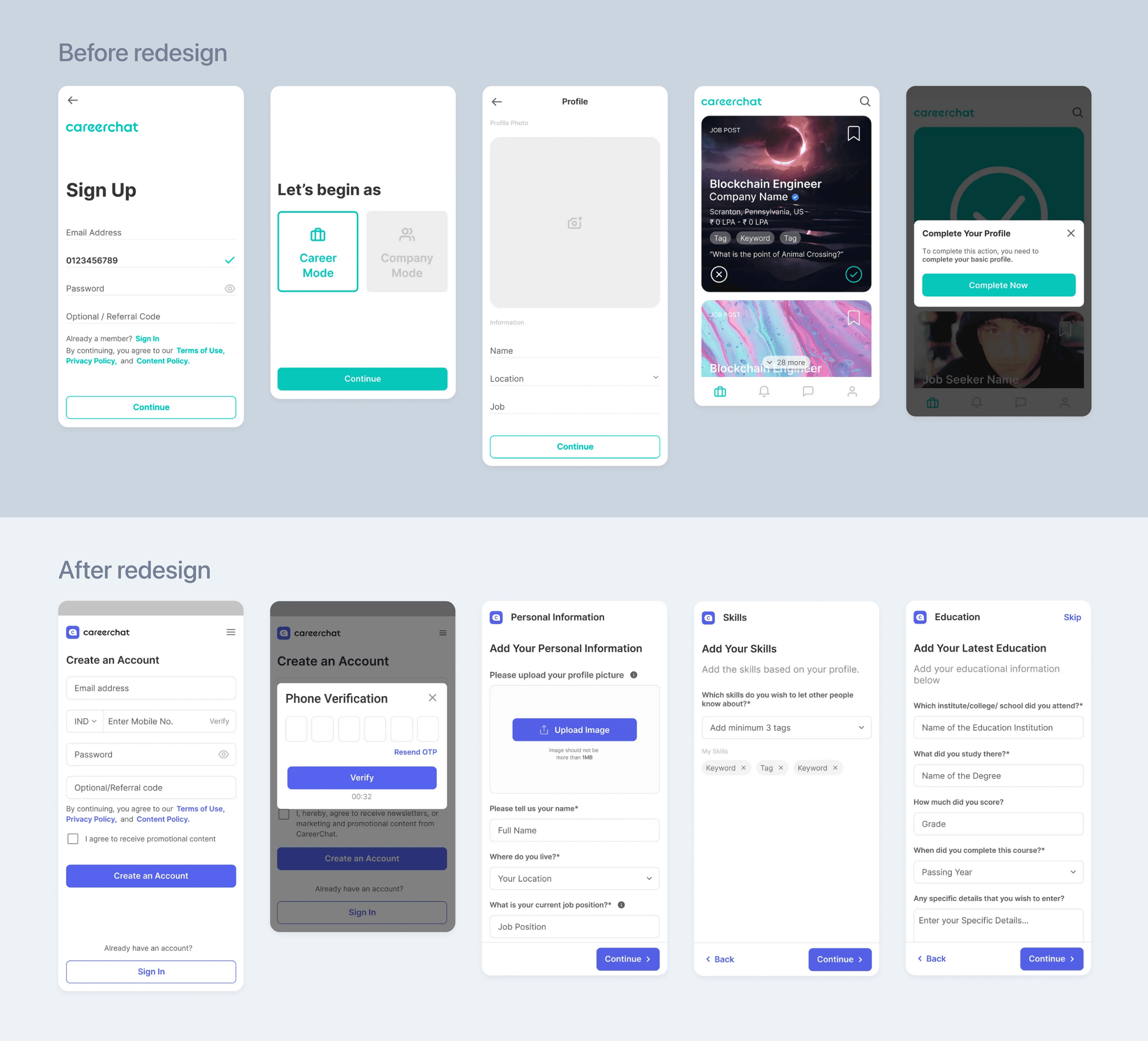
🏄 Streamlined Onboarding
Removing hurdle and limiting information load for streamlined experience
BEFORE
User faced a hurdle when trying to view the job post for the first time, because user has to input more information to do so.
AFTER
User is instructed to complete the whole profile during the sign up process. Hurdle is no longer required, and clear instructions are provided through the whole process with labels and CTAs.
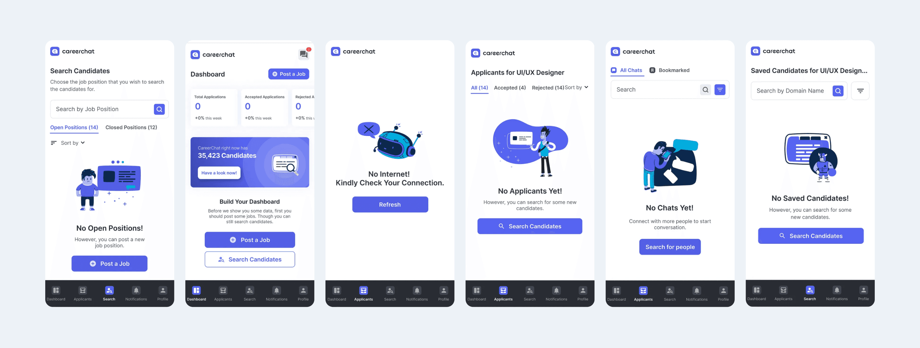
🏃♀️ Making the Empty States Actionable
Letting the user know that it’s empty and nudge to complete an action
BEFORE
Signifiers indicating that the screen in empty didn’t exist before the redesign.
AFTER
The combination of graphic asset, clear message with the relevant Call To Action now indicates user that content is empty and further nudges to complete a main feature.
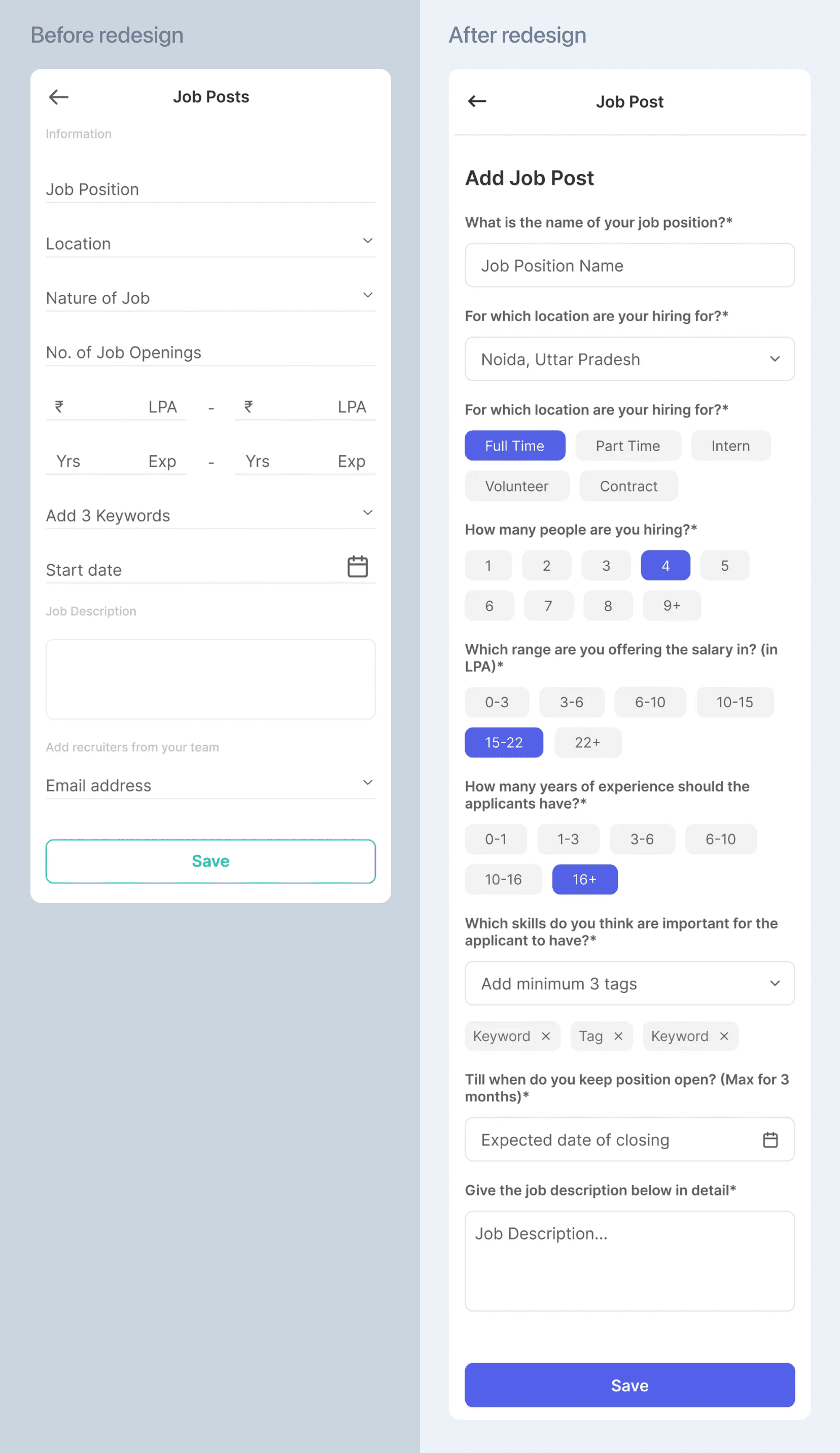
✨ Easier Form Completion
Utilizing different input methods for different types of information
BEFORE
When using forms for various purposes, user has to manually type in every information.
AFTER
Labels are provided for each section of different information for better navigation.
User can utilize chip input for quicker input.
REFLECTIONS
💭 What I’d do differently next time...
Localizing and empathizing with the target audience at an early stage
While designing the flow of the onboarding process, I once had to shift my design direction quite dramatically, due to my lack of understanding of the target audience who were young adults of India.
The UI flow I initially considered optimal did not resonate with my target audience, who preferred a more clustered UI to a simplified one.
Learning the lesson that I should (truly) put myself in user’s shoes, I realized that localization is key and that I should think of these things deeper in the early stage.
Design first, think of the cost later
Having the knowledge and capability to both design and engineer does surely help in facilitating the collaboration with developers, but I also realized that it can often hinder and obstruct the creativity.
While creating designs with the lowest possible development cost can surely reduce time and effort in production, I later found myself constantly questioning: 'Would the design solutions have been more creative if I had disregarded the development cost? Would that have been the right choice?’
In short, if I had the opportunity to work on the CareerChat again, I would definitely put down the development cost-first mindset and focus on creating the optimal user experience and journey.

